
Looking at Eggleston’s Before Color pictures, newly reborn, requires an odd energy of de-colorization.
By Tim Davis
For years, Tod Papageorge, the head of the Photography Department at the Yale University School of Art, would begin student critiques of color pictures with the question, “Why color?” Color was an aesthetic choice and Papageorge felt students needed to account for it. Photography, that neat Greek neologism given us by the English chemist Sir John Herschel (whose father discovered Uranus!)–meant silver prints, black and white ones, and Type C’s or Cibachromes represented as extroverted a stylistic decision as wearing white shoes after Labor Day.
Of course now those values have reversed. Photographers making monochrome pictures are engaged in an antiquy practice that is going the way of platinum and palladium. Earlier this year Kodak announced that it was discontinuing the production of black and white silver paper, except for a small reserve for the “specialist.” So as a specialist practice has replaced a standard one, there must be darkrooms full of photographers teetering over the deep sink of obsolescence. I’m not sure if Papageorge asks his students “why black and white?” but he probably should.
William Eggleston was the photographer who best anticipated this reversal. He is credited with prescience in taking to color photography the way the Frenchman Charles-François Daubigny did to tubes of oil paint after American expatriate portraitist John Goffe Rand filed United States Patent No. 2,252, September 11, 1841, “Improvement in the Construction of Vessels or Apparatus for Preserving Paint, &c” –effectively enabling plein air painting.
Eggleston has indicated that “Memphis, 1965,” a deft physical picture of a young boy in profile with glamorous James Dean hair parking shopping carts outside a supermarket, is his first color print. It evidences much of what made this color work acceptable to the specialized community of artists and curators who defined the limits of art photographic practice in the 1960s. It is, first of all, not about color in any extroverted way. There is no exclamatory “GARBO SPEAKS!” moment in Eggleston’s color pictures. They aren’t muted, but they define themselves even less around issues of color than Walker Evans’ SX-70 Polaroids would eight years later. The picture is clearly a member of a species of formally challenging art photography coaxed into public sense by John Szarkowski at the Museum of Modern Art in New York. Made with a small hand camera, extending and elaborating the visual ethos of quality photojournalism, personal, intent, visually complex, Eggleston’s pictures, even to someone colorblind, are clients of the law firm of Faurer, Frank, Friedlander, and Winogrand.
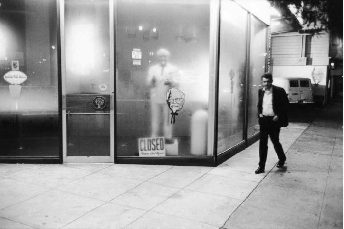
from Before Color @ the Eggleston Trust
Eggleston’s decision to switch to color film coincides with the mass availability of color processing in the U.S.
And yet in the introduction to William Eggleston’s Guide, Szarkowski insists that “reduced to monochrome, Eggleston’s designs would be in fact almost static, almost as blandly resolved as the patterns seen in kaleidoscope…”
Szarkowski goes on to argue that the color in Eggleston’s pictures is part the tint of the unexpected in his work: “These pictures are fascinating partly because they contradict our expectations. We have been told so often of the bland, synthetic smoothness of exemplary American life…that we have come half to believe it, and thus are startled and perhaps exhilarated to see these pictures of prototypically normal types on their familiar ground…who seem to live surrounded by spirits, not all of them benign.”
EXPLORE ALL WILLIAM EGGLESTON ON ASX
Looking at Eggleston’s Before Color pictures, newly reborn, requires an odd energy of de-colorization. It is exactly like watching the “colorized” Casablanca, to which Wilson Markie’s COLORIZATION, Inc. added its pastel splash in 1988, and which Ted Turner broadcast with the tag line, “Play it again, Sam; This time in COLOR!” It is the sensation of form and essence split; of pictures whose intent and execution are familiar, but whose impact is utterly different. The colorized Casablanca looks inextricably borne in 1980s, a decade whose design sense is not remembered for its causal relationship with color (see here Sally Skoglund, Frank Stella, paint-splattered jeans, the costumery of Miami Vice, the omnipresence of mauve, etc.) I decided to look into the popularization of color processing around the time of Eggleston’s switch to color, and found this story on someone’s family website:
“In Florida in 1963, Sandy Fleet saw a little camera store swamped with customers. Originally, the place had been a dry cleaners with a drive-up window. But rather than plug the window up, the new owner was using it as a convenience for his customers, so they could drop off film.
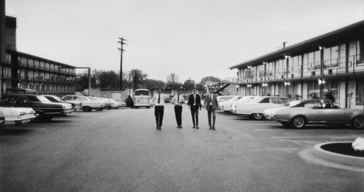
from Before Color @ the Eggleston Trust
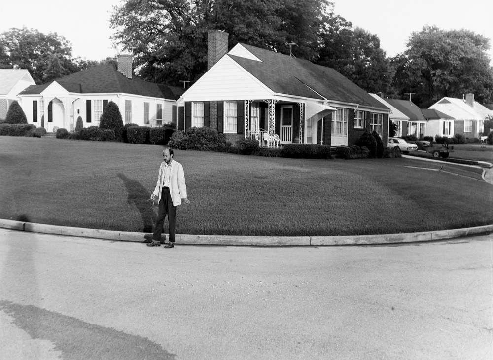
from Before Color @ the Eggleston Trust
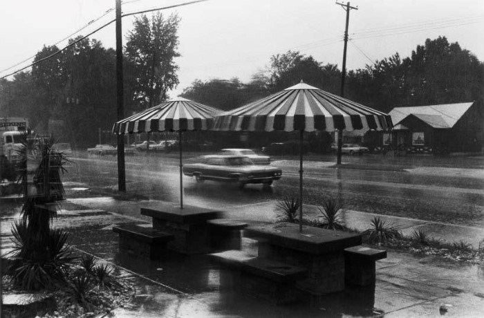
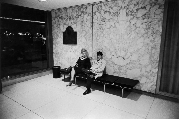
@ the Eggleston Trust
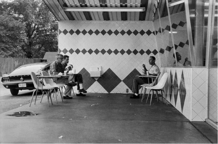
from Before Color @ the Eggleston Trust
Like a memory, it is familiar, without being a cliché. The picture is memorious, as if Eggleston’s only governing criterion was to photograph every scene he encountered that felt like a déjå vu.
Sandy was late for a meeting, but he stopped anyway. He pulled into the lot and just watched. The little store was mobbed. The owner, an artistic type, probably a photographer, couldn’t handle all the people. The poor guy wasn’t organized right. He took orders as quickly as anyone could, but he was swarmed and he was going down, like General Custer at Little Big Horn.
The problem was the drive up window that was bringing in a constant line of cars. It was a great, simple business idea, but it overwhelmed the place. But if it had a more sophisticated structure, if there were dozens of drive-up windows, and if they were spread throughout the city, and if there were a central film processing plant…
In 1965, Sandy opened the first Fotomat kiosk in Point Loma, California. A year and a half later, as though there’d been an explosion, there were 2,800 stores across the country.”
Eggleston’s decision to switch to color film coincides with the mass availability of color processing in the U.S. Some of what was “unexpected” in the new color pictures was the fact that they were brazenly, pedestrianly, in color, straight from the Fotomat. His switch to color might have been just a visual trope; like Picasso switching periods from Blue to Rose (occasioned, some say, by something as unconceptual as his discovery of opium.) But the more I look at the Before Color pictures, the more visually consistent they seem with High Color Eggleston. The pictures look the same. They just mean something different.
No one countenances the term “snapshot aesthetic.” In fact, it is effectively an oxymoron.
No one countenances the term “snapshot aesthetic.” In fact, it is effectively an oxymoron. Of all the bodies of work to which that term was ascribed, Stephen Shore’s American Surfaces, with its brazen bad flash and obsessive fixed subject sets, is perhaps the only appropriate one. The term’s application to Eggleston’s oeuvre arose out of his subject matter, the omnivorously radial daily purview of a particular, local individual. It contained none of the heroic, road-tripping projecthood of the typical hand camera cowboy, but lurked through the familiar commute for its descriptive sense. Eggleston, like many an artist from the American south, had intuited W.H. Auden’s epigram, “A poet’s hope: to be, like some valley cheese, local, but prized elsewhere;” or William Carlos Williams’ instruction: “By listening to his language of his locality the poet begins to learn his craft. It is his function to lift, by use of imagination and the language he hears, the material conditions and appearances of his environment to the sphere of the intelligence where they will have new currency.”
The poet, Robert Kelly, advises young writers to read any poem as if they’d discovered it scrawled in their own handwriting after a night of serious drinking. Eggleston’s pictures, even these early ones, feel read in that way. Like bolts out the black and white blue, they feel seen, as if for the first time, on very familiar ground. In [picture #54] a woman bends into the rear door of her 1964 Rambler Ambassador, in unfailing midday light. There is almost nothing remarkable about the picture. There is none of Friedlander’s disorienting fragmented image plane; a bit of Winogrand’s dynamited horizon, but none of his uncured choreography, and little of Frank’s fascination with the materiality and meaning of the American scene. Neither does the picture operate, as in Shore’s 35mm projects, by imitating the language and essence of a genre of unexpressive popular photography. The picture is formally polite. If you adjust for the inflation of time, not even the hubcaps or the outfits are worth noticing.
And yet the picture is compelling. It clings to some link between cephalic regions governing sense and cognition. Like a memory, it is familiar, without being a cliché. The picture is memorious, as if Eggleston’s only governing criterion was to photograph every scene he encountered that felt like a déjå vu. And if memory is the function of the work, his photographic decisions are unassailable. He has avoided the obvious Hollywood fuzzy-edged vignetting. He has recognized that memory is related to photographic language, because of how accurately it imitates the observable. In Freudian parlance, a “screen memory” is a fake, covering remembrance that obscures up a deep, repressed sentiment. This picture is exactly the opposite: a present emotion that overwhelms the simple screen of a flat straightforward photographic image.
There is something in the politeness of the picture making that enables Eggleston to tread this ground, making Proustian pictures of future memories. Politeness, some say, is the machismo of the American south. These pictures aren’t out to wow you with their formal newness —one hardly notices the frame in them— nor are they out to shock you with their near non-content. Eggleston is avoiding the designy patterned frame and visual analogies of his elder, Cartier-Bresson. He is also, though, sidestepping his own generation’s discordant formal reactions to the same Cartier-Bressons. The Before Color pictures are closer to the “democratic” practice of his Democratic Forest, than to the brazen content-extending depth charges of William Eggleston’s Guide. But the tone is sub-democratic, innocent, almost naïve. They seem like the photographs of Chauncey Gardner, the sheltered, uneducated servant suddenly loosed on the outside world by his keeper’s death in Jerzy Kozinsky’s novel (and Hal Ashby’s film) Being There; a character who utters powerful koanic statements about subjects he does not begin to understand. It is easy to see these pictures as a prototype for the awestruck savvy of the color work to come. But when one thinks of Bill Eggleston making these simple straightforward pictures of clean average southern towns and their mute stiff citizens, it is strange to remember that they were made in a war zone. The Civil Rights movement was erupting all around the American South during the making of Before Color, and in comparison to the documentary images in the news (black and white, hand camera, of the southern “scene”) they seem either reactionary or blind.
Switching to color disallowed that comparison. I am not suggesting that Eggleston was concerned with politics; but that rather than continue to operate in a medium that was becoming politicized, Eggleston moved to keep his very personal work unconcerned. Politics is never, after all, in the vernacular. And Eggleston color work is fiercely vernacular, remembering how much of history we know, not from government edicts or official records, but from private and personal correspondence about the daily flux and muddle of life. Color photography, looking so embarrassingly like life, is the great descriptor of banality. Banal things are, etymologically speaking, compulsory or common, available to all. The color in the post- Before Color pictures is the glue that holds them fast from the journalistic, and from the political realm that relies on photojournalism for its grammar, syntax, and sounding horn. The color is the idea in Eggleston’s work, leaving Before Color pictures looking like Eggleston’s pictures, but separate somehow, from his art.
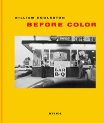
William Eggleston, Steidl
(All rights reserved. Text @ Tim Davis. Images @ the Eggleston Trust.)